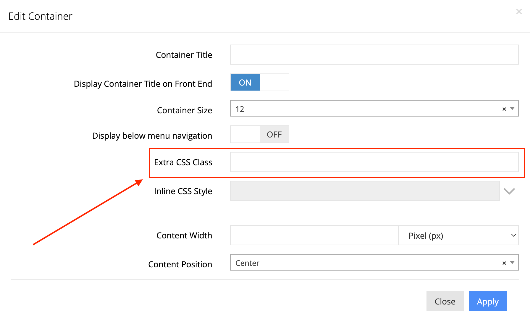
You have a lot of flexibility when it comes to managing, positioning, and structuring your content; however, what if you need to style the content, outside of the formatting that’s available in the “Content Module,” and you don’t know CSS? Luckily, we have CSS classes, included with all our design templates, that extends your capacity for styling content! To take advantage of any of these classes, simply add them to the “Extra CSS Class” input field, of any container or column:
Here are these general styles, with their descriptions, separated by design subject:
Full Width Containers
no-gutter
Used for when you need to remove margins and expand containers and columns (use on both 12/12 container and 12/12 column to expand to full screen). For example, it would be used for banners and full-page carousels.
Hide/Show Elements Depending on Screen Size
hide-below-960
Use this class to hide elements on mobile screens (hides under a screen width of 960px).
@media only screen and (min-width: 960px) {
.hide-above-960 { display:none !important; }
}
show-below-960, hide-above-960
Either of these classes can are for when you need to hide containers on desktop and show on mobile (hides for screen widths of 960px and above).
Limit and Center Containers/Rows
container
Adding this to a content container limits the width of the container to only a portion of the full page width and centers it horizontally. Typically, this gives a container a width of 96% and limits the width to 1200px, on desktop, and 92% width on mobile.
Buttons
button
You add this to buttons (<button>) to give it consistent styling with other buttons on the site. If your element is an anchor, you will need to have a nested span (<span>).
If you’re adding a button element, make sure to include the class attribute in the button tag and two, nested children spans (<span>). For example:
<button class=”button”>
  <span>
    <span>Action Text</span>
  </span>
</button>
Alignment/Floating of Elements
item-left
Assigning this to the “Extra CSS Class” field of a container or column, or just giving a specific element this class will give the CSS float value of left (float: left;).
item-right
This is the same as .item-left, except elements with this class will float to the right (float: right;).
Hiding
hidden
To hide any content on the site, simply add this class to the container or column.
.hidden {
     display:none!important;
}
Element Widths
These classes are useful for whenever you can’t assign a width out of 12, using a dropdown menu, in the admin panel. All of these have a specific width and have left and right margins of 1% over a screen width of 767px. By default, all of these will get a width of 100% and no margin on screen widths 767px and below (mobile).
grid12-12, grid-full
width: 98%;
grid12-11
width: 89.67%;
grid12-10
width: 81.33%;
grid12-9
width: 73%;
grid12-8
width: 64.67%;
grid12-7
width: 56.33%;
grid12-6
width: 48%;
grid12-5
width: 39.67%;
grid12-4
width: 31.33%;
grid12-3
width: 23%;
grid12-2
width: 14.66%;
grid12-1
width: 6.33%;

